
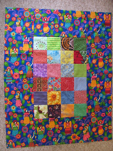
OK, turns out there is very little contrast and I am very much undecided about it.
A inner border probably would have helped, but I don't think I'm going to unpick it.
Although I like wide, I think I perhaps did stray into the territory of TOO wide on the border. I'm thinking it would probably be better if I trimmed it down a touch.
Any other suggestions?

4 comments:
I like it! We really want to see all of the angel fabric so if you start trimming it, there go the angels. How about a medium wide border after the angels, then binding?
keep the wide border, but tone it down with a solid for the binding, like .. red.
that's what I'd do. I think it looks awesome.
I like the way the center squares kind of blend into the border. It makes you look at it more than once which is a good thing. Since it is for a baby, I think they will enjoy both the wide border and the center as they roll around on it and explore the design.
Well my Google Reader has been off for quite awhile, so I just saw this today. I like it! I'd go so far as to say it looks somewhat sophisticated, the way the center blends with the border. Also very charming. Loved Jessica's suggestion of a read binding.
Post a Comment