
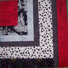

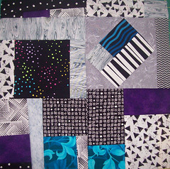
By the time I finished these blocks I had landed on a setting idea that I thought I was happiest with, so that's what I worked on the rest of this weekend. None of this is sewn together yet except those strip set borders:
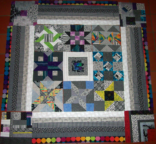
To guide your viewing, let me just say that it is "upside down" in this picture, but I did not rotate it because then the angle looks funky. Also, I can already see that in the center section I will switch the top middle and the right middle blocks (according to where they are in this picture) to balance the colors more. Also, sorry it's dark - it was late evening by the time I got around to this. Keeping those things in mind...
Actually I'm finding I like it more today than I did yesterday, but I'm still going back and forth between liking it and fearing it might be too busy/funky/weird/? I mean it certainly is busy, and the borders and lack of sashing do nothing to calm it down. It does have a certain charm to it, though.
Now wait, I am anticipating that someone somewhere will want to know what it would look like with the strips sets flipped around so the white is on the outside, so I laid that out, too. Try to cleanse your palate before you look at it, though...
c
l
e
a
n
s
e
Ok, here it is (and the good news is, this picture is right side up and all the blocks have been moved around):
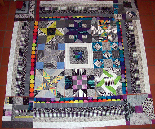
Hmm...personally I definitely like the first one better. I will continue to mull it over. I have one more block and lots of scraps that will go on the back.

7 comments:
This is really a cool piece, Libby! What are you going to do with it?
I have to say that I like the second one better, for some reason it looks more calm. I think the white on the outside echoing the very center gives the eye more relief from the motion in the rest of the quilt. (it doesn't end on motion) Also moving the colored strip to the center helps to unify the colors in the blocks. The proximity is better. But that is just my opinion.
i'm a fan of the second layout, sorry. i like the colored dots closer to the colors in the center of the quilt.
good luck making a decision.
~jess
I also vote for #2. I love those big colorful dots on the inside. Both versions are great, but I have a slight preference for the second one.
I'm with the rest - number 2 it is xx
it's so cool! I love all the black and white and punches of color! your setting blocks are really awesome too! i like both layouts, maybe the first one just a smidge more :) this is gonna be such a cool quilt!
I am so late getting here that this is all probably sewn together! You did find great bright dotted fabric to tie it all together with. Very cool quilt!
Post a Comment